Tag Archive for: web fonts

How Important Is Typography in Web Design?

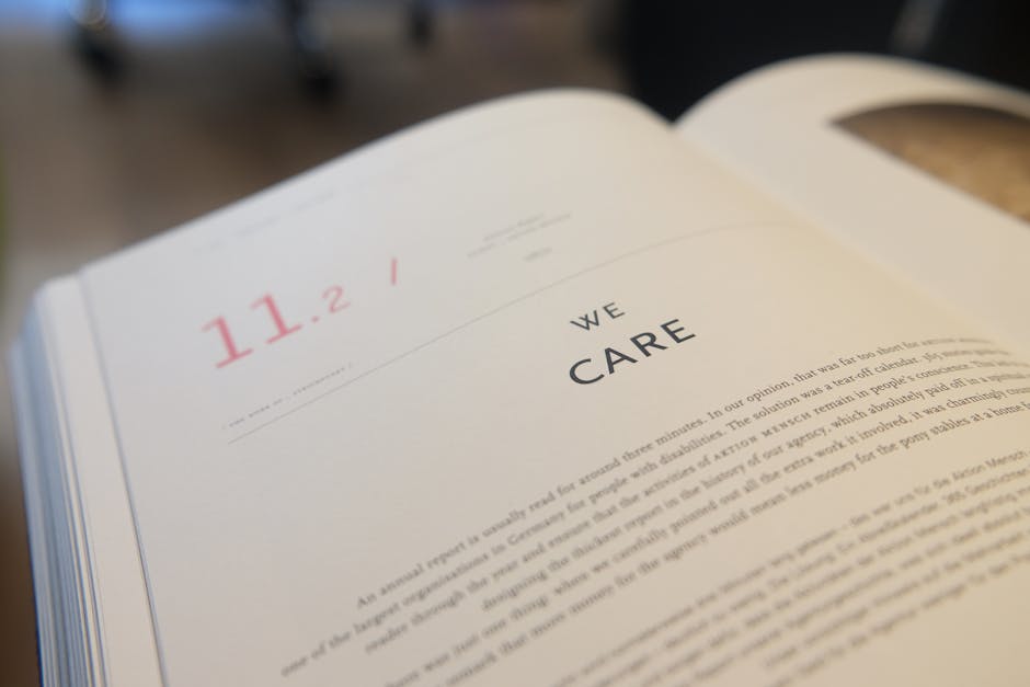
blur, book, business

Most of the time, typography is often disregarded as something trivial but if you think about it, it is equally important as the other web elements of your site.

When you visit a website what is the first thing you notice aside from the actual content? Of course, it’s the look of the website including its chosen typefaces. Would you want to explore a website that is disorganized or a website that seems like it hasn’t been thought about seriously? NO!

This is why typography plays a significant role in web design. Typography not only polishes your website to make it look posh and chic. It also says a lot about your brand and your content.

BELOW ARE 7 REASONS THAT WILL PERSUADE YOU THAT TYPOGRAPHY IS IMPORTANT:

  • IT PLAYS A ROLE ON DECISION MAKING

    Something that seems unimportant actually a very crucial role. Typography could either make or break your content. Your readers’ perception on the contents that you publish will greatly affect website activity. Studies have shown that readers prefer some typefaces over the others because they believe that certain texts, with a particular typeface, are more factual and reliable. Choose a typeface that would make an impact to your website and something that would not stress readers.

  • IT TRIGGERS EMOTIONS

    This is the magical powers of typography. It not only influences your decisions, but it triggers emotions. When you see something that looks nice, you will be convinced to check it out. This will encourage people to visit your website often.

  • TYPEFACE RELATES TO YOUR BRAND

    As previously stated, typography is the reflection of your brand. It will give your readers a heads up on what to expect upon visiting your website. They will have an idea on the content of your website and the quality of products that you offer.

  • THE PERFECT TYPEFACE RECEIVES READERS’ TRUST

    Typography sets the overall mood of your website. You have to ensure that the website will make customers feel comfortable in trusting whatever it is you are saying. That’s why it is imperative to make your typeface relatable and professional.

  • TYPEFACE ENHANCES READABILITY

    The focus should NOT be: to make a website look pretty! Complex typefaces could affect the text’s appearances and website visitors may NOT find it readable. The main point of this is that content should be understandable. It shouldn’t make your readers question what they are reading.  Fonts are responsible for the user’s readability so you really have to choose wisely.

  • SECONDARY TYPEFACES ARE ALSO IMPORTANT

    You don’t stop when you find the ONE perfect typeface. A secondary typeface is equally significant because you also need to indicate essential subheadings. It should also scream like your heading. You can opt to use the same typeface, but there should be a distinct difference between the heading and the subheading. This is why the last reason important.

  • TYPE SIZE IS MATTER TOO

    It’s not only the typefaces that are valuable, but also the type sizes.  You want to emphasize certain words and highlight important data for readers to know the key points that support to the topic.

Helpful Typography Tips

Close-up of Hand over White Background

Yes, it is important to create a website that appealing and compelling to your target audience, but the main purpose of typography in web design is to communicate effectively to your website visitors. The design you will choose for your website is a one-of-a-kind aspect of your brand.

In this article, you will learn tips to help improve the readability and appearance of your website and to communicate well to your readers. Read on the important tips below:

  1. LIMIT THE NUMBER OF FONTS

    While style is an important factor in designing, and while it is very tempting to use as much styles as you can, it to use multiple fonts. Sticking to one or two is enough Two is already a lot! The aim here is to make the website clean and to retain a certain structure. Remember that LESS IS ALWAYS MORE.

  2. CHOOSE STANDARD AND SIMPLER FONTS

    Choosing standard fonts guarantees better readability. Readers used to seeing system fonts such as Arial, Garamond, Calibri, Verdana etc. Not unless if your website requires a specific typeface, it is best to stick with fonts that people will easily identify.

  3. REDUCE YOUR LINE LENGTH

    The key to a perfect website is readability and legibility. Your line length shouldn’t be too narrow, nor too wide, it just has to be the right length. The suggested length by The Baymard Institute is approximately 60 characters each line

  4. CHOOSE A TYPEFACE THAT’S READABLE DESPITE THE SIZE

    Your website viewers will use different gadgets so there’s isn’t a single uniform resolution or screen sizes. Just make sure that you would apply a typeface that will work well on a tiny screen or a huge desktop.

  5. CHOOSE A TYPEFACE THAT MAKE EVERY LETTER DISTINCT

    To be more specific, the chosen typeface should be distinct. The ‘i’ should not be mistaken for the “l” and vice versa. It happens in a LOT of typefaces so avoid confusing ones. Convenience of your readers should be your priority.

  6. AVOID USING ALL CAPITAL LETTERS

    Capitalizing letters should only be used to emphasize a point! You should NOT capitalize the whole blog post or web page.

  7. THERE SHOULD BE ENOUGH SPACE BETWEEN LINES

    This refers to a typography term called leading. If you increase the lead, you are increasing or widening the white space in between lines of the text. By doing so, you are also increasing the readability of the text. Don’t decrease the leading because that would be very hard to read.

  8. MAKE SURE YOUR COLOR CONTRAST IS SPOT ON

    Colors also play a vital role in typography or in web design. The most important thing is to consider the readability of your text. It is pretty much USELESS to use the same font color and the same background color. The W3C recommends that small text should have a contrast ratio of at least 4.5:1 against its background. Large text should have a contrast ratio of at least 3:1 against its background.

  9. AVOID TEXTS IN RED OR GREEN

    Color blindness is a common among men (8% of men are color blind!)

    It is recommended to use other color shades and avoid using red or green because these are the common colors that affect those that are color blind.

  10. DO NOT USE BLINKING TEXTS

    Flashing or blinking texts may cause seizures to some people, while others find it annoying and distracting. It is best to avoid anything that blinks!