Which CMS platform should you use?

Are you building a new business website? Do you need to find a new content management system (CMS)? There are loads of CMS platforms available. But which is the best CMS for your business website? With so many, it can be difficult to choose between them. The good news is that we are taking the time in this blog post to compare the three most common open source CMS platforms so you can make a decision easily. Ready? Then let’s get started.

What is a CMS?

The first step is to define what a CMS is. CMS stands for Content Management System, which is a back-end platform on which your website will run. Think of it as the backbone of your website on which you can build the designs and content that front end users will see. You will have an admin panel that only you and other site admins will see where you can add new content, change existing content and tweak the look and feel of your website. It is important to note that you don’t necessarily need a CMS platform. But you should consider getting one if you are likely to change or want to add new content to your website in the future.


Pitting the leading CMS against each other

When it comes to choosing a CMS platform, you will probably be choosing between three of the leading platforms. These are WordPress, Drupal and Joomla. Each of the platforms have been around for over a decade, each are free and each have legions of loyal fans and webmasters who use them daily. But only one can be the best for you.

WordPress

WordPress is often synonymous with CMS platforms. It powers an enormous half of the world’s CMS websites and around one fifth of the world’s total websites. This huge amount of WordPress sits means that the platform has a huge community ready to offer advice and help when you need it. It also has a huge amount of templates and plugins so that you can customize your website in anyway that you can. Best of all, the platform is super intuitive and virtually any one, however computer savvy, can learn to use it.

Joomla

Joomla actually offers a lot more customization options than WordPress, but more choice makes the platform more complicated to use. Joomla developers are some of the best around, however, and you’ll find solutions on Joomla to problems that you can’t fix on WordPress. As a result, Joomla is suitable for web developers who know what they are doing but not for small business owners.


Drupal

Drupal is a great solution if you are an enormous website with a team of administrators working on it full-time. But the solution is so large and complicated that it is impossible for a small business owner to manage on their own. It’s great for some, but not for small business owners.


In conclusion

As a small business owner there is only one CMS that you should be using and that is WordPress.


The Impact Of Color On Your Website’s Design

Web design needs to accomplish a lot of things. It should look appealing, be easy to navigate, and capture the attention of readers. One way to impact the user’s behavior is to use color.


Color holds a strong power in affecting the emotions and behavior of people. When it meets your eye, it urges the thyroid glands to release hormones that cause the change in emotion, mood, and attitude. Read on to know exactly how colors play in web design.


Where To Use Colors?

The impact of colors on your website might not be instantly apparent but they do create a difference. The main areas that you must consider are the borders, backgrounds, pop-ups, headlines, and buttons.


The selection of colors in these key areas relies on the type of users that your website targets. Let’s discuss more details now.


Selecting The Right Color

Color is very crafty. You have to know how to use it properly with the appropriate audience and for the right reason.


Studies show that women prefer primary colors (purple, green, and blue) and dislike earthy tones (orange, gray, and brown). On the other hand, men are attracted to masculine colors (blue, black, and green) but are averted with purple, brown, and orange.


Look at the website of Avon. You’ll notice that there are no earthy tones on the homepage. Meanwhile, the homepage of Axe has black as the background to appeal to their male audience.


Color Tips That Will Enhance Conversion Rates

Making the psychology of color as the basis, we made a lit of colors and the emotions they invoke. These colors can help improve your website’s conversion rates when done properly.


Use Blue To Gain Trust

Blue gives a subtle message of serenity and reliability. That’s why a lot of the biggest social network and banking websites use this color, like Facebook, Paypal, and Capital One. Never use this color for a food website because it can restrict appetite.


Green For Outdoor And Organic Products

If your website relates to organic, outdoor, and environment, then green might be a perfect color option. Green is usually associated with nature, eco-friendly, and outdoors. When isolated, it can be a good color for call-to-action.


Red Is Effective For Call To Actions

Red is a truly an eye-catching color. It’s linked with power, boldness, and passion. If you want your website to be youthful, choose bright red.


Orange Grabs Attention, Yet Sophisticated

Compared to red, orange is more subtle and balanced. Fun, brilliant, and energetic, this color suits designs that require physical activity and energy. It’s also perfect as a background for websites that have anything to do with gadgets.


Black To Give A Sense Of Elegance

Black is a luxurious color. It gives a feeling of elegance, power, and style. It suits best for websites that focus on luxury products and premium commerce services. If you like to bring contrast with the other colors in your website, use black.


Here’s why you should forget about an app and build a responsive website instead

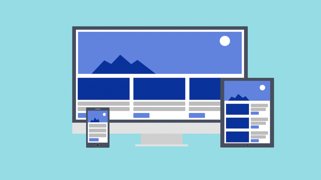
Guess what the median number of app downloads is each month. How many do you think? Five? Three? Nope, it’s zero. Zilch, zip, nada. So why do so many clients still want to build an app rather than invest in a mobile responsive website?


Apps have been incredibly popular for ages. But that doesn’t mean they are perfect for your business. In fact, in most cases you are much, much better off investing in a responsive website and not an app.


The circumstances where you need an app

Now before we get carried away there are a couple of cases where you probably should consider building an app. But these are the only cases where it is an appropriate strategy. They are:


  • You are a global brand. If you are a global consumer brand, your customers will probably expect you to have an app. They are probably already searching the App Store or Google Play looking for your app. You don’t want to disappoint them.
  • Your product is an app. Obviously you need an app if your main offering is app-based. Of course, this isn’t the case for the vast majority of businesses.


Now we have those out of the way, let’s look at why you need a responsive website.


Customers search on Google, not on an app store

When you last needed to find a local business, where did you look first. It wasn’t Google Play, was it? Nope. You probably opened up Google on your phone’s browser and searched there. That’s how everyone finds a local business and that’s because it’s the best way. Therefore it is imperative you have a mobile friendly website ready to greet potential customers rather than an app that no one will find.


You risk your brand image

Not having a mobile responsive website doesn’t just risk your performance in search results, it risks your brand image, too. That’s because people don’t just use Google to find your website, they could find it through social media, an online ad or any one of loads of other methods. And more than ever people are using browsing the web through their phone. If they come to your site and find it isn’t mobile friendly, they aren’t going to hang around long. It’s unprofessional, hard to use and a turn off to customers.


People don’t download apps

As stated at the start of this post, people don’t download apps. FACT. So even if you are building an app for your website, people probably won’t download it. Let’s look at this properly. If you build one, how are people going to find it. Short of you telling them, the only way they are going to find it is by visiting your site. And since they are on your website in the first place, why not invest in a responsive website instead? Doesn’t that make much more sense?


Thinking about getting a responsive website now? Our team is here to help. Get in touch today.


What is microcopy and how does it impact your website


There are so many different questions to ask then it comes to creating a website. Should it be responsive or built for desktops? What colors should be used? Should it be parallax scrolling? What images should we use? But by far one of the most important questions is what should go on the homepage to make it great.


Browse the web for just half an hour and you’ll probably find dozens of different directions you could take with your homepage. It can be impossible to tell which is best for your business. In fact, the truth is that, just like every business is unique, every homepage is to. What works for someone else—even your competitor—may not work for you. While we can’t tell you exactly what your homepage should include (unless we’re designing it for you) we can suggest several things that every great homepage layout has.

Why your homepage is so important

Your website’s homepage is probably the first part of your brand many customers will interact with. Everyone knows the importance of making a great first impression and usually this duty will fall to your homepage. Make a bad first impression and customers will probably leave your site immediately. Make a good one, and they may just stick around and convert.


The trouble is that unlike your brick and mortar store, there is no friendly or helpful sales assistant to guide them round the shop. They have to do everything on their own. That means your website needs to be designed so that it can help visitors find what they are looking for and answer key questions such as:


  • What you do?
  • What you offer
  • Why you do it better?
  • What to do next?
  • How to get in touch?


Your homepage has to answer all these questions and more if it wants to be really effective.

What makes a homepage great?

Below we’ve outline the key elements that every great homepage needs to have.


A Headline

Your headline should succinctly sum up exactly what your company does. If someone doesn’t know about you when they land on your site, they should know after reading the headline.

A Subheading

This lets you expand on your headline, offering more information once you have captured the customer’s attention.

A Call to action

Now you need to point your customer in the right direction. This could be to sign up or to learn more or to make a purchase depending on what you do and offer.

An Image or video

One of the best ways you can further get across what you do is by using images and videos. People respond much better to these mediums than they do to text.

Logo

Your website brand has to be in line with your offline brand and one of the ways to do this is by including your logo prominently.

Nav bar

You need to guide your customers round your website. Your navigation bar is how you achieve that.


These are just a handful of the elements a great website needs. For more information get in touch with our team today.

The importance of microcopy for your website’s conversion rate


A lot of clients come and ask us the best ways to improve their conversion rates. Often they are a little shocked when we suggest adding a tiny bit of text to their site. It may seem small and insignificant but microcopy can make a huge difference. Here’s what it is and why it is important.


What’s microcopy?

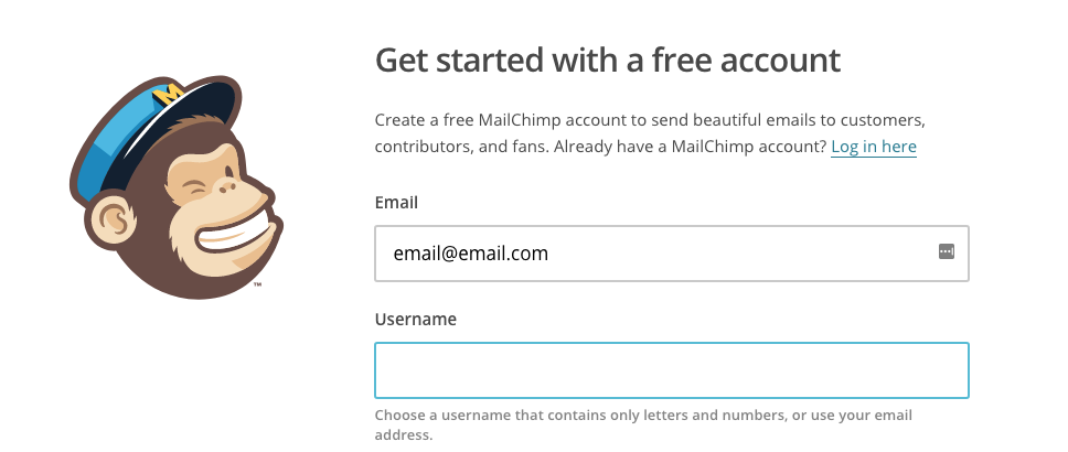
Microcopy is the tiny bits of informational text that you see on sites that help guide you through the signup process. A great example is the one below from MailChimp which pops up when users click on the username box and tells them exactly what their username can and can’t be.

If it wasn’t for this bit of microcopy users could become annoyed or confused at why their username wasn’t being allowed.


There are plenty of other cases where microcopy could be used such as in:

  • Buttons
  • Error messages
  • Reassurance
  • Form fields


You may miss them when you sign up to a service, but they can make a big difference when you need them.


Why is microcopy so important?

Here are the reasons microcopy is so important for your site.


It adds information

Your microcopy should add information that users may need to continue on the conversion journey. It they are likely to get refused or worried to the point where they quit, microcopy should be added to eliminate confusion and help the user complete the process.


It adds trust

When completing the sign up process, you are asking users to put a lot of trust in your brand. They could be concerned about the way in which you will use their data but microcopy can be used to put an end to those worries.


It adds a human touch

Your site is in danger of feeling cold and inhuman without a touch of microcopy. Often sign up forms can be sterile and demanding (you’re asking for a lot of information, after all). But with a touch of microcopy you can create a conversation between your business and potential customers, offering tips to help them complete the process faster.


It boosts conversion rates

Microcopy can be huge in boosting conversion rates. As you can see from the post so far, it can add trust and eliminate confusion so that users are more likely to continue through the conversion process and complete it.


How to start writing microcopy

It’s easy to get started writing microcopy. Before you start writing, however, you need to identify places where microcopy is needed in the first place. Start by going through your site as if you were a customer, trying to get lost and making note of places where you think a little guidance could be added. Once you’ve done that, you can start creating short, informative and easy-to-read messages that offer all the advice users need.


If you need help adding microcopy to your website, our team are here to help. Get in touch today.

2018’s web design trends to watch out for


Is it time to create a new website this year? If so there are certain trends that you should be watching out for and ready to take advantage of. Web design in 2018 is going to look a lot different than it did in a lot of the previous years and understanding the trends will be crucial to creating a website that can stand the test of time. Don’t go mad with the trends listed below, however. Use them all and your website will look a mess. Go through them all carefully, however, and select the best ones for your brand and you’ll be able to create an awesome forward-thinking website that gives your business a great reputation and earns you loads more customers.


Brash and vibrant color schemes

2018 is not the year to use understated colors on your site. One of the biggest trends that you will see when browsing the web in 2018 is the use of highly saturated and vibrant colors on the websites of the biggest and coolest brands. For years now, designers have stuck to relatively safe web colors. But now they are throwing off the shackles, partly in an effort to create something new and partly because screen displays now offer a much higher resolution that means these kind of colors look better than ever. Use this trend and you’ll be sure to create a bold and eye-catching website.


Think mobile first

THIS is the one trend on the list that you absolutely must follow. To not do so would jeopardize the future of your website and your business. Even now with the huge roll that mobile plays in our lives, some new websites are still designed that aren’t mobile friendly. This is a huge no-no. Not only will it make for a bad user experience or your customers (and they won’t be customers much longer) it also risks you being penalized by Google. Because if your site isn’t mobile friendly they won’t be ranking you high in mobile search results. Speak to an experienced web design company to make sure you get a high quality mobile responsive website.


Illustrations en masse for the first time

Everyone loves illustrations in books and magazines. But they were sadly lacking from websites for a long time. This was partly due to design tastes and partly because it was head to create illustrations that looked good on a website. But not anymore. Some of the biggest companies in the world are using illustrations to sell their products and services and you should be too. It won’t just help you explain your offering better, it will help boost your company’s image, too.


Gradients are making a comeback

We’ve all got used to flat design over the last few years but gradients will be making a comeback in 2018. It won’t be the icon style gradients that you used to see on the iPhone apps, however. These will be bog, vibrant color gradients used over images and for backgrounds to create more interesting effects than flat design could hope to achieve.


For further guidance on creating a website in 2018, speak to our team today.

Why you should add a chatbot to your website

Chatbots are becoming huge business. The market in the US was worth and estimated $703 million in 2016 and it has been estimated to have a CAGR of 35.2% until 2022. It’s no wonder the market is growing so fast when the benefits of adding a chatbot to your website are huge. Here’s why you should add a chatbot to your website today


Customers can get support in seconds

As a growing business, it can be hard to respond to customers quickly by phone and email. But a chatbot allows you to answer customers in seconds. Some providers will include support agents as part of their package who provide real time assistance while others will allow customers to submit questions and their email address to get a reply. They also make it easier and more obvious for customers to get in touch than trying to find an email address hidden on the site.


Chatbots offers personalization

Great chatbots provide a level of personalization that verges on a human-to-human conversation. And personalization is a huge selling point in today’s market. Rather than offering cold demands like “sign up” and “register”, chat bots offer a warmer way to get the user to convert. Think of the bot like a friendly salesperson in your local retail store that offers the advice and support you need when shopping. With a great salesperson, you’re more likely to buy.


User engagement goes up with a chatbot

Websites now need to engage users like never before. If you can get your website to engage your website more than a competing business can, then you are much more likely to win the business. A chatbot is vital in providing the kind of exceptional user engagement customers are looking for.


You can get insight from your chatbot

If you use an AI-based chatbot, you will quickly find you can learn a lot from it. The longer you have the bot on your site, the more data you can gain from interactions that can be analyzed to help you improve your site, products and services.


Chatbots can make payment easier

As a business owner you want to make it as easy as possible for your customers to pay. Chatbots can now integrate with the payment process to help customers when they need it. Often it isn’t just cold feed that stop customers from paying, but problems that occur at checkout. A checkout-based chatbot can help alleviate customers of these concerns and issues and increase conversion rates as a result.


If you think it’s about time to install a chatbot on your website, our team of web design and developers in Arizona can help. We’ll help you find a suitable chatbot and integrate it into your website. We’ll also be on-hand to help you troubleshoot any problems that come with having a chatbot on your site.

Navigation menu design trends to look out for


Are you looking for inspiration to design the navigation menu of your new website? There’s a lot of different designs to choose from aren’t there? That’s a good thing given the fact that designing a navigation menu is one of the most important and hardest things to do when it comes to building a new website. That’s why we’ve taken the time to curate all of the current trends when it comes to navigation menu design. You’ll quickly see that while there are a lot of options to choose from, not every design will be relevant or appropriate for your business. Hopefully, however, this list will give you the inspiration you need to come up with a killer navigation menu for your business’ website.

Simplified navigation

Do you ever think that navigation menus are too complicated? That there are too many categories on them or that they contain too much information? If so then you might like simplified navigation menus. The thought is that most menus are too complicated when it comes down to it and that users don’t like be overwhelmed with choice. Instead, they just need a few options to choose from to find what they need. This actually works really well for most websites. But it won’t work for everyone. Ecommerce websites, for example, will struggle to make this option work.

Sticky navigations

Sticky navs are quite a common sight today. Even though they weren’t just a few years ago. In fact, you’ve probably seen a website that uses a sticky navigation recently. With a sticky navigation, the menu bar literally sticks to the top of the page when you scroll down the site rather than disappearing. This makes it much easier for users to use the nav bar to find a particular page even when they are towards the bottom of the website. The only problem is that a sticky nav can become slightly annoying, especially when it takes up valuable page space.


Sidebar navigations

There’s a good chance you’ve never actually seen a sidebar navigation. They are fairly rare and only really used by more “quirky” companies like design agencies in an effort to differentiate themselves. Rather than have the navigation in the normal place at the top of the page, it is positioned vertically down the left hand side. Cute, but it’s not practical.

Mega navigations

Been on an ecommerce store recently? Then chances are you have seen a mega navigation. These are the huge drop down navigations that contain dozens of different pages or categories in order to make it as easy as possible for users to find what they are looking for. They are practically essential for an ecommerce store because of the number of pages they contain, but they can also be useful for businesses that offer a lot of different services. Careful, however, because they can become overwhelming.


Need help creating your website’s menu? Our website designers can help. Get in touch today.


5 ways to improve your internal site


Great internal site search can be a huge help to your customers. Even more so if you run an ecommerce store with thousands of products on it. But so many internal site searches don’t work properly.


No one wants to spend ages searching through your site for a single post or product if they can use a search bar instead. Think about it; you want your brick and mortar sales assistants to point customers in the right direction of a specific product, so why should your website be any different? It shouldn’t right?


Well if it is, here are five strategies to fix it.


Make sure users can find your search bar

Okay, this may seem a bit obvious, but you’d be amazed at how many websites hide their site search bars to the point where user struggle to find them. Here’s a hint, don’t hide it towards the bottom of your page, in the footer or even in the sidebar. Your search bar needs to be immediately obvious as soon as someone lands on the page. That means placing it at the very top of your website in the navigation bar. Make sure the color of the bar is different from the rest of the site and that you include the word “search” in it so users can’t possibly be mistaken.

Incorporate autocomplete

It’s important that your customers can find what they are looking for as quickly and as easily as possible. Autocomplete functionality is a great way to do this. When a user starts typing in their search, your search bar should be suggesting conclusions to their query that tally with the products or services on your website.

Don’t be harsh on errors

Too many search bars offer no results if users spell a single word incorrectly. This can be hugely frustrating for the user if they’ve missed out a single letter from a word and have to go back and add it in. Instead, your site search should serve up items that match as closely as possible to the initial query.

Make use of the thesaurus

Ideally, your site search should be smart enough to realise when someone is searching for a particular product, even if they don’t use the exact words. Understanding synonyms and using them in search results is key to an intuitive search that all users can make use of.


Tag your posts properly

Okay so if you’re letting customers to search through all of your blog posts, this one is huge. It is so, so important that you tag every blog post with care, including every keyword that someone might use to find this post. Take the time to think from a user’s perspective about what search terms you would use to find the product and include them as tags. But don’t go mad with this. Otherwise you’ll leave users with hundreds of posts to sort through.


If you want to have site search done properly, our team can help. Contact us today.


Why Good UX is crucial for customer loyalty


There’s a lot your website has to do. It has to tell new customers about your company and your product. It has to sell your product or service to them. It has to offer customer support. It has to be a lead generation tool. And now thanks to the dwindling number of people visiting brick and mortar stores, it also has to develop the kind of connection and customer loyalty that was previously done by stores and sales assistants. This is hard for most websites to do. But there is one way that any website for any type of brand can foster customer loyalty and that’s through great user experience. Here’s how.


Why bad UX stops loyalty from ever forming

Let’s take a second to consider why bad UX is such a problem when it comes to customer loyalty. After all, if a customer likes your product they will stay loyal, right? Not always. Customers don’t enjoy using a website with bad user experience. In fact, they will probably leave it and go to a rival website that is better to use. Even if it’s their favorite brand, there’s so much competition online that it’s not worth putting up with a site that provides a bad user experience. Without any customers hanging around it’s going to be hard to create customer loyalty, right?

Great user experience helps you get new customers and also keep old ones

Too often, the focus of websites is on converting new customers at the expense of old customers. Many business owners view websites purely as a lead generation tool that keeps the customer conveyor belt moving. But what about current customers? They are the only ones you are going to be able to develop customer loyalty with. That’s why developing a user experience that makes browsing great for current customers is so important. If you can keep your current customers happy, you don’t have to focus so much on generating new ones. Your current customers will just keep coming back.

Great user experience creates brand advocates

The ultimate goal when it comes to fostering customer loyalty is to create brand advocates, a few special people who are crazy about your brand and will promote you to everyone they know whilst vehemently defending you. But are customers likely to recommend you to their friends if your website is awful to use? Nope, in fact they’ll probably tell them how terrible it is. Bad user experience could be stopping you from turning loyal customers into staunch advocates.

Great user experience lets customer identify with your brand

Customer loyalty can only truly be fostered when customers really understand your brand. The only way to achieve this online is to make sure that your brand and message is consistent across every medium and every page of your website. The more coherent the user experience, the better the brand message will get across. And the better the message gets across, the more customers will understand it and the more loyal they will become.


If you want to boost customer loyalty through great UX, speak to our web design team today.