5 problems with website builders


It can seem incredibly appealing to use a website builder for your next website project. After all, there are so many out there that promise to offer a quick and easy fix to something that could otherwise cost over $1000.


But there are some huge problems with website builders that they conveniently don’t tell you about. Today we’re going to look at the major problems with website builders and why you should choose a more tailored and dedicated approach to web design.


Problem 1: It takes ages to build a site on one

If you’re using a website builder then you probably going to be doing it yourself. While this certainly could save you some cash, it definitely isn’t going to save you much time. Often these website builders can take a bit of getting used to. That means investing dozens of hours into getting to grips with the software before you are even able to start building your new site. As a small business owner, your time is money. Is it worth spending it on building your own website? Probably not.


Problem 2: You’ll end up spending more than you think

Sure the basic plans on most of the well known website builders looks great. A new website for just a couple of dollars a month! What could go wrong? Obviously it isn’t this straightforward. Not only is there the cost of your time when it comes to building the website, you’ll probably quickly find that the most basic version of the builder doesn’t give you everything you need or want. To get something satisfactory will often mean upgrading to the most expensive package which can cost around $50 a month. Don’t forget, this is an ongoing cost, too. That means paying $50 every month you have the site. Have it for five years and you’ll be forking out $3000.


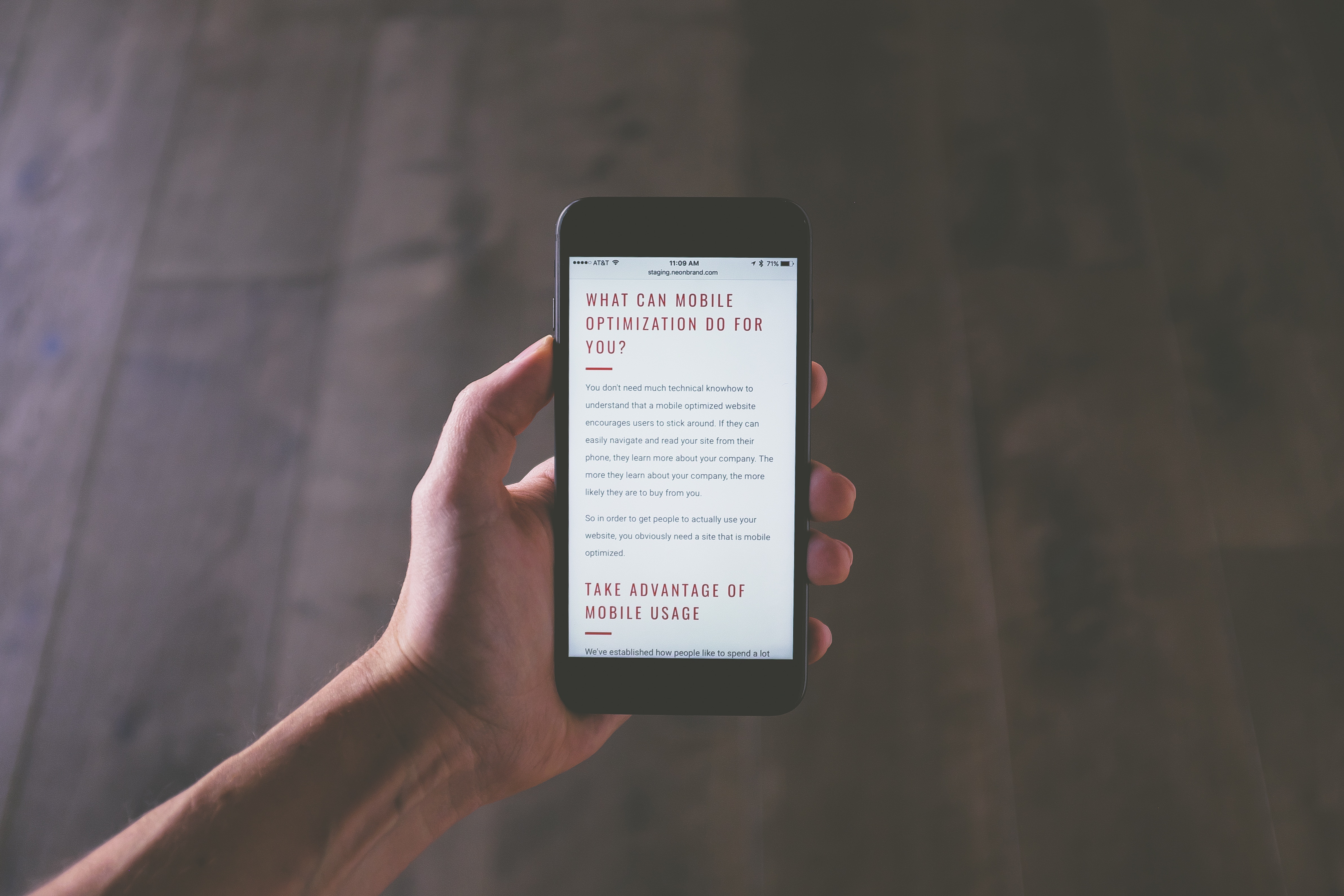
Problem 3: It won’t be unique

One of the major problems with website builders is that everything they offer is templated. Even when you add your own images to the site, you’ll still be adding them into a structure that a lot of other people have. Trust us when we say that this will be noticeable when you browse the web. Is your company unique? Or do you want it to look like thousands of other stock websites?


Problem 4: You can’t transfer it

What happens when you get fed up with the website builder and decide you want to transfer the site away from the provider. Well tough luck. You probably can’t. Often your website is tied to the website builder’s platform which means that it won’t function anywhere else even if they let you take it. You often won’t even be able to transfer all of the content and blog posts in code form. You’re tied in forever.


Problem 5: Lacking SEO

Everyone wants to be found in Google. But often these website builders aren’t well optimized for SEO. This can make it hard for these websites to rank in Google. Even if you hire an SEO company, they may struggle to work their magic on your site if it is built using a website builder. There’s only so much you can do from an SEO perspective.


So there you have it. Five reasons not to use a website builder. If you want a more dedicated approach to web design, speak to us today.


5 Subtle Changes That Will Transform Your Website

When visitors come to your house, you want to present your best to give a good impression. The same good impression should be applied to your website. You only have a short time to grab the attention of your visitors so you have to be clear with your message.


Here are five ways to improve the performance of your website.


Make It Mobile-Friendly

One of the subtle ways to improve conversion rate is to implement a responsive design. With the prevalence of mobile phones nowadays, your website should keep up. Make your website easy to navigate on mobile phones.


If your website doesn’t load on a mobile phone, chances are, your potential customers will abandon it right away. Based on a survey conducted by eMarketer, about 55% respondents say that they won’t purchase from a brand that has a poor mobile experience. This simply means that you’re going to lose those conversions if you don’t optimize your website to be mobile-friendly.


Gather And Analyze User Behavior Metrics

Website owners, like you, should know how your users behave to help you grow your business online. Google Analytics is a great tool for finding this valuable information. This tool will help you gather user behavior metrics and make small adjustments to your online offerings.


Crazy Egg is another good tool to know the exact details where your users are clicking. This helps you make effective pages and generate more sales. Don’t forget to evaluate your analytics at least once monthly.


Write A Concise Value Proposition

As a website owner, your main goal is to convince visitors quickly that you have the solution to their issue. It’s common to get overwhelmed in listing all the benefits of your brand on the homepage. However, they end up littering your homepage and messing up your value proposition.


The better way is to write a concise value proposition and post it in the center or in front of your landing page or home page. Allow this message to be the main message of the page. Together with a simple design and an eye-catching image, you’ll have a better chance of getting the attention of your users and persuade them to perform the next step.


Simplify Forms

Nothing is more tiring than filling out a form in the real world. This also holds true online. To encourage your users to fill out the form on your website, keep them simple.


As much as possible, use as the fewer number of fields of required information. Use predictive text to allow your users to use auto-filled. Give clear error messages when wrong information is filled on the fields.


Be Specific In Your Calls-To-Action

The call-to-action (CTA) is very important because it encourages users to take the next step. As much as possible, make CTAs more specific to get to the point more directly. Avoid using confusing and generic CTAs because they fail to entice your users to take the next step.


Also, make sure that the CTAs are visible so you can lead the users to their right location without searching. Keep everything simple by prompting users to “join free for three months” and go the extra effort to reassure users that they can cancel the registration anytime.

7 Key Features No Website Should Be Without

Whether you use a website to promote your business or you are in need of a new one for your new business venture, it’s important to keep a quality website to reach online users.

The first thing you should do is set up your domain with a good, unforgettable URL. Next is to decide on some big decisions.


Here are seven key features that your website should have to increase brand awareness and create a positive customer online experience.


Product Or Service Images

Your goal of making a website is to promote your business and products to potential customers. For this reason, always include basic information about your business, like mission/vision statements and products/services offered. Keep text clear and concise.


Depending on your venture, put the necessary items that describe your scope of business. For instance, show product images if you sell products or customer testimonials if you work in the service industry.


Contact Information

To get in touch with your customers, put your contact information on the website. This includes address, phone number, and email. Consider putting an accessible contact form so your customers can tell you their issues and questions directly.


When sharing your phone number or email address on the site, put them in a link. This way your customers will be able to send an email or give you a call with a simple click.


Security

This feature is very important if you’re selling products online. You need to assure your customers that any shared confidential information, like credit card number, will be kept confidential. Several security certificates you can secure include SSL, VeriSign, and TrustE.


Search Engine Optimization (SEO) Content

A good looking website isn’t enough to create a website. It should be well optimized to earn more traffic. Fundamentally, the keywords and content of your website should be optimized.


Learn the fundamentals of on-page-SEO or hire an SEO agency to do the job for you. Make sure you ask them about their scope of SEO expertise.


A Mobile-Ready Edition

Mobile phones and tablets are the recent technology which drives an increasing amount of web traffic. To keep your website updated with the trends, make sure that it’s easy to navigate even on handheld devices.


To make a mobile-friendly site, fluid widths are used to adapt any screen size. Scalable images and adjustable layouts will be designed to create a better web experience on a variety of devices.


Frequently Asked Questions (FAQ)

Even if you have presented the complete information about your products or service on the site, customers will always have questions. Sometimes the questions of customers are the same. To save time, compile all commonly asked questions and answer them in the FAQ section.


Unique And Large Font

Some of the most popular companies have a specific font to give a good recall from customers. Lately, a wide selection of fonts is available to better express your brand. From Adobe Caslon Pro to Blokletters-Balpen, your choice of the unique font should give a subtle hint about your company.

Effective Tips on How to Improve your Website’s UX

With everything becoming more and more visual, color probably sits in the very middle of it. In web design, this means a lot considering how colors can affect users in a lot of ways in terms of engaging with the website. In this article, we are going to understand how color impacts your website’s design as well as knowing which ones to use.  The Psychology of Color The main foundation for this inquiry is color psychology. We already know that the use of color obviously affects almost everyone. So let us understand why.

In its most basic definition, Color Psychology is the science of how color affects human behavior. So it is not a surprise to know that it is just one of the branches of a broader field of behavioral psychology.   Now let us take this to statistics. In a research made by Satyendra Singh, it is found out that color plays an influence of at least 62-90% in the mere 90 seconds a customer forms an opinion about a product. What this means for web design, most especially for those who sell products and services, is that color greatly affects conversion rates. Therefore, color is critical!  You don’t think that Facebook is color blue just because Mark Zuckerberg likes it. Amazon is orange not because one of its founders like the fruit. And lastly, Google is not simply white because it just feels like it.

What we are trying to say is that behind every successful websites’ web design considered color as one of its important choices. So let us delve deeper into that and identify some color psychology that may be helpful to you.  Where to Use Colors Before anything else, let us first identify the parts of your pages where the use of color is very important. This is to give you a good visual of how to put it all together once you know this.  Pop-ups Borders Headlines Background hues Primary web banners or hero graphics Buttons, especially call for action  What Colors to Use Now, let us identify what colors to use on your website to make it more appealing according to the purpose you want to be achieved.  Blue Blue is a good color to foster user’s trust. This explains why Facebook, even how toxic it may seem sometimes, has garnered a lot of users. It is the color most associated with peace, order, loyalty, calm, and trust.  Orange Orange creates a sense of urgency, which could also be impulsive. It stimulates physical activity, competition, and confidence. So you can understand why Amazon often leads you to shop more than you should.

Black Some descriptions attached to the color black is luxury and value. It even reaches the point where the darker the tone, the more luxurious it feels. Black exhibits elegance, sophistication, and power. You can notice this on a number of high-end websites and products, usually cars and jewelry.  White White can be associated with freedom, spaciousness, and breathability. The use of white space has become a go-to for much of modern contemporary designs due to its psychological association with liberation. So it is also a good color to compliment other bright ones as it can make everything seem orderly and not crowded and overwhelming.

Websites make information accessible, which is why it’s ideal for businesses. However, making a website isn’t adequate because offering an excellent User Experience (UX) is more significant. Your visitors should be given a remarkable UX in order to upgrade their overall browsing experience.


Here are some effective tips on how to improve your website’s UX.


Utilize White Space

Contrary to popular belief that white space is just wasted real estate, it’s actually important to a great web design. White space makes your content stand out and give more focus to the elements close to the text. It also makes your website look trendy, fresh, and open.


Keep in mind though that white text consumes up space and having too much of it might take over some important information. The solution is balance. Determine the most important parts at the top of your web page and emphasized them with some space.


Make It Mobile-Friendly

Mobile devices are starting to drive large traffic to many websites, which is why it’s important that your website responds well to these gadgets. Go mobile-friendly to make your website visible and accessible to any device. Remember not to compromise a UX design with quality.


Keep It Simple

It has been discovered that online users have an attention span of only 8 seconds. That’s why you need to grab the attention of your users as quickly as you can. Get rid of unnecessary information and only include the most significant information about your business.


The best way to organize your homepage is to add anchor links so your users don’t need to scroll the whole page. With anchor links, users will be direct to specific points of the page.


Make Calls-To-Action Eye Catching

Distinct calls-to-actions (CTAs) allow users to navigate the site more easily. Consider the color of the buttons because different colors stimulate different emotions and attitudes. The best colors for CTAs are red, green, orange, and yellow.


Don’t neglect the actual words you’ll use for the CTA buttons. The words should be actionable, time-sensitive, and bold. For example, “Call Today”.


Use High-Resolution Image

There’s nothing more discouraging than seeing a blurry picture of a product. An image helps communicate a message to your customers that’s why you should choose the best quality. If you can use real pictures, then go ahead because they’re more effective than stock images.


Use Bullets

Bullets can help improve the readability of your web page. It allows users to quickly read the information about your product or service. This will help create an attractive proposition.


When making the bullet points, go creative as possible. Use images to make your point more understandable and appealing. With the isolation of the points, your users will understand your proposition more clearly.


Prevent 404 Errors

Next to a slow-loading page, 404 errors are another frustrating encounters of users. This error totally destroys the journey of users to the website. To catch any 404s, use Google Webmaster tools.

The Impact Of Fonts On Your Website

The way you utilize fonts can impact the performance of your website. Its impact isn’t as big as images, but fonts can help give a slight boost to the speed of your site. It can even improve user experience and readability. Read on to know more about the impact of fonts on the multiple aspects of your website.


The More Typefaces Utilized, The More Files To Download

Remember that every utilized typeface on your website needs a file download. Regularly, sites will look good with 2-3 different typefaces.


Adjust the color, size, and mass of the text if you want to make a contrast between different forms of content on the page. Consider using system fonts to speed up the load time. Unlike typefaces, system fonts require no download.


To ensure that system fonts are solely utilized on limited screens, consider using a media query. The media query will call in the download of the font file if the font suits the current size of the screen.


Font Selection Offers Personality

The main idea of using a font selection is to create the personality of your website. For this reason, you need to evaluate the core purpose of your business, product, and content. Once you decide which message you want to communicate with your customers, select the typeface that demonstrates your content’s idea.


Take Taco Comfort Solutions, for example. Observe how the font they have selected gives you a feeling of being in a green environment which they promised to offer with their air quality comfort systems.


The Alignment Of Text Affects Readability

The way you position and arrange the text on your website can have a large impact on the content’s readability. You can align the font in four traditional ways: center, left, right, and justified. However, you can pretty much do any type of alignment with the presence of Photoshop and other editing software.


The text alignment of your page should help direct the users to the most significant information and see its flow and construction in the page. Make a long text article interesting by utilizing the strength of colors, alignment, and font-sizing.


The 4 Basic Types Of Fonts

Serif

This type of font is ideal for headings. For a more powerful impact, use it together with other font types. Never use this font for innovative companies because they’re known to be outdated.


Sans-Serif

This type of font is serif minus the feet. It’s ideal to use for your website’s main body. Never use this font on a food website because its simplicity doesn’t encourage appetite.


Script

Also known as calligraphic, script looks like a real handwriting. You can use this font in headings and together with other fonts. Never use this font if your website is a business based on facts because it doesn’t offer a reliable feel.


Decorative

This type of font offers an eye-catching visual effect. Use this font in your logos and other fonts for a more attractive web design. Never use this font on your main body because it will hard to read.

What Are Anchor Links And How Do They Work

Many small enterprises have finally taken the initiative to learn the art of anchor links. This is a good technique to enhance navigation and credit external sources. Best of all it helps in search engine optimization (SEO). In this article, we’ll talk about the nature of anchor links and their function.


What Is An Anchor Link And How Does It Work?

An anchor link is a clickable link that brings you directly to a particular page area. Basically, you’re making a different URL on the same page. You can attach a link to an image, button, phrase, or word. The options are endless.


Anchors come in handy when you have a lengthy text that you want to split into sections. The reader can click on the links to transfer between sections. A good example is a table of contents where every part is an anchor tag.


The Advantages Of Using The Anchor Links

The main advantages of using the anchor links are as follows:


  • No Hassle In Scrolling: Using the anchor links doesn’t force your users to scroll down a large amount of information to search a specific section. Just a click on the link and your visitors will be transferred to a particular page.
  • Aids In Search Engine Use: Anchor links make things easier for users as Google sometimes use this link to direct a user to a particular section of your page. It’s quite helpful when you aim to direct traffic to a particular spot on a page.
  • Keep The Page In order: You can keep all your content and documents in one place by using anchor links. If you have made multiple anchors on your website, you can show them all in a nice floating anchor menu.


How To Add Anchor Links

The first thing to do when adding anchor links to a page is to write out your copy. Next, put the copy on your website’s new page or current page. Identify where to place the link on the anchor link and where you want it to be directed.


Once the anchor link and anchor destination are decided, add the HTML code, using the <a> tag to make the link and to make the destination. The format of the anchor link is: <a href=”#anchor1″ > Anchor Link Text</a>. The format of the anchor destination is: <a name=”anchor1″>Anchor Destination Text</a>.


Make sure that the “a href” and “a name” are the same, of course except for a “#” in the href formula. Like everything else, use the anchor links sparingly. It can displease your visitors once you overuse the anchor links.


Tips For Making Anchor Links


  • Make sure that you use the same words in the anchor links and the referred subheadings.
  • Make the sub-headings are distinguishable as main elements of the page.
  • Make sure that the anchored destination is seen without scrolling.
  • Place the anchor links as a form of page-index: on top of the page, just under the page heading.

What Are The Benefits Of Adding Videos To Your Website

In today’s ever-changing world of marketing, many businesses have finally joined the trend of adding videos to their websites. And there are a variety of reasons for this. Besides giving informative messages, a video is a good means to engage your users. Other benefits of adding videos to your website are discussed below.


Drive Traffic

Whether it’s a new copy, blog post, or a video, search engines appreciate new content. Your search engine rankings go higher each time you add content. Making a custom video is a great way to create fresh content.


To fully optimize your search engine, use targeted keywords in the title and tags. Consider making a Youtube channel to create multiple locations of your video. Use social media to share your video to expand your reach to potential customers.


Sends Messages More Effectively

People have a short attention span in terms of marketing nowadays. Forget about writing a 500-word post about the product. Today, the trend is using a short video to communicate to your customers. A video can be easier to understand and offer as much information by speaking to potential customers through more visual means.


Don’t limit yourself to making an informative video. Add some entertaining elements so it can be remembered by your customers. If you’re lucky, your video might go viral.


Provides Personality

Gone are the days of writing “Get to know us” profiles on your websites. Instead of writing the likes and dislikes of staff, why not show the culture of your company in a more visually appealing way? Whether you aimed to be credible, humorous, or elegant, it’s your choice. You need to emphasize that message through a video.


Builds Relationship With Visitors

Making a custom video that features your employees is a good way to build a strong relationship with your visitors. People build trust with people they know. So, why not make your visitors feel closer to you through a video showing the profiles of your team?


Accessibility Of Content

Publishing a video can allow customers to watch your marketing campaign in a variety of digital platforms on any device. This is very convenient for your customers because they can access your content anytime and anywhere. Whenever your customers are stuck in traffic with a smartphone or relaxing at home with a tablet, the content is available to watch.


Reach A Wider Audience

Same as how you can reach a wider audience by linking your blog with social media networks, you can increase your reach with videos. By allowing your visitors to share the video, you can start a domino effect until it gets viral. Again, consider posting the video on different media platforms, like Youtube, to get an extra place for promotion.


Encourage Constant Visits

Getting regular visitors on your website is the best thing in advertising. You need to keep your visitors interested by posting new engaging videos that offer value to them. It’s an opportunity to show them your value propositions whenever a visitor returns to your website so you can urge them to buy your product.


Parallax Scrolling And How Does It Work?

One of the best signs that tell you your website is good is the conversion rate. If you have been in the world of SEO long enough or even just a while, then you have probably heard of it. But for the sake of those who are still new to this, we have written down this very simple guide on conversion rate—what it is about and how to calculate it.   Understanding What a Conversion Rate Is The basic foundation of understanding is the definition. So let us begin with that.

Conversion rate simply pertains to the percentage of visitors on your website or landing page that convert. By convert, we mean the things you aimed for them to do. This actually depends a lot on the kind of website you have, or if you are a business, what it is you do. So to give you a brief idea of how visitors convert, below is a list:  Purchasing Submitting a form Calling your business Signing up Registering Downloading Upgrading  Basically, all of these are ways of engaging with your website. So if they made an action, then they are converting. Conversion is a measurable action that a potential customer takes towards actually becoming a customer.

How to Calculate Conversion Rate Now, let us head on to calculating it. Doing it is actually very easy. You just have to follow this formula:  Conversion rate = (conversions / total visitors) * 100%  You have to divide the number of conversions you get in a given time frame by the total number of people who visited your website or landing page. After that, multiply it by 100. That’s it.  However, that is just conversion part. Before that, you will have to identify the variables or date that you need for the formula. For this, you will need to implement website tracking. Here is how you can do it:  Begin by determining what you want to calculate. Is it for lead conversion or product sales? Get the appropriate data from your website analytics program.

You can actually sign up to Google analytics for this. Once you have identified that, do the following formula according to the conversion you want to calculate.  Lead Generation Number of Leads Collected / Total Traffic to Site x 100 = Conversion Rate  Sales  The formula for the sales is actually the one written above. So if you can simply follow that.  How to Improve Conversion Rates There are a number of ways you can do to improve your conversion rates. Here are some of them:  Emphasize and focus on call to action buttons. Make sure that you are clear about what you want them to do. If you want them to purchase, then put up a sign that directs them to do it. Don’t lead them to a treasure hunt. Improve landing pages by experimenting with layout, content, style, and functionality. Make sure that what you want to convey can be easily seen such as your value proposition and more. Foster trust. Place some testimonials and make your services and products searchable.

If you’ve been into 2d gaming or web design, perhaps you’ve heard about parallax scrolling. If not, then you’ve come to the right place. In this article, we’ll talk about its function, benefits, and downsides.


What Is Parallax Scrolling And How Does It Work?

Parallax was first made in the 2D gaming that utilized different picture backgrounds. As you scroll down a page, it creates a visual illusion of a 3D effect. A similar concept is used in web design to encourage users to stay longer on the page.


Parallax scrolling is a technique where you can scroll down to the page, creating a compelling effect. Often, this comes with a link that jumps you down to that particular page section, incredibly making the user experience convenient. Instead of allowing your readers to click on a website to search for the information, this scrolling technique allows them to see the content on one page.


The Benefits Of Parallax Scrolling

Parallax scrolling is growing popular because of these following reasons:


Increases user Engagement

A parallax background is unique and shows information in a visually appealing way. It allows users to control the scrolling operation, giving them an active interaction role with the website.


Easy To Navigate

The scrolling technique is simple to do. Since the content of the page is shown on one page, users will be spared from the hassle of clicking multiple links and buttons.


Good In Telling A Story

Parallax scrolling provides an ideal setting to tell a more interesting story about your company. Different layers react uniquely to the scrolling behavior of users. This creates a sense of depth that allows your website to tell multiple storylines.


The Downsides Of Parallax Scrolling

When deciding to use a parallax design, you should know some of these issues:


Slow Load Times

Parallax design is highly loaded with animated scripts. This can increase the load time of your website, hence result in traffic bouncing and endanger the ranking of your website.


Not Enough Browser Support

Not all browsers are compatible with this type of web design. For instance, a page with loads well in Internet Explorer might not work in Firefox. This can hurt your user-experience.


Not Mobile-Friendly

Parallax adds code layers to a website. This makes it swollen, hence won’t work well on mobile.


SEO Problems

Most parallax websites aren’t suited for SEO. They’re usually focused on the visual and not on specific topics.


Insufficient Analytics

Unlike traditional sites that help you track user’s behavior, parallax scrolling makes it difficult to track using analytics. It’s hard to know what content interests visitors because they see your content on one page.


What You Can Do

To solve the issues above, you can make your website search engine-friendly by making two versions: a parallax website and a stationary HTML page. You can also limit your use of parallax scrolling. Also, consider making a blog and post it frequently.


What’s Your Site’s Conversion Rate: How To Calculate It And How To Improve It

I’m quite surprised that there are still business web owners who ignore conversion rate. This performance metric can help you show the actual situation of your website, especially if your website is a major element of your sales and advertising campaigns. Generally, your marketing is doing better if your conversion rate is high.

Read on as we discuss more conversion rate including its calculation and ways of improvement.


An Overview Of Conversion Rate

The conversion rate is actually a complicated topic. In simplest terms, it’s the rate of visitors coming to your website that fulfills a particular goal. For instance, how many users visit your website to buy a certain product, sign up for a registration, or book a consultation.

There are many other conversion actions users can make on a website. In general, a conversion rate is a measurable action that transforms a potential customer into a paying one.


How To Compute Conversion Rate

Computing the conversion rate of your website is actually simple. All you need is a website analytics to gather necessary data, such as the number of leads, total traffic, and the number of visitors. When collecting data, make sure that you utilize an adequately long time frame.

The first thing that you need to do is decide whether you’ll need to compute for product sales or lead conversion. Next, collect necessary data from your website analytics software. Finally, follow any of these formulas:


Conversion Rate for Lead Generation = Number of Leads Gathered / Total Traffic x 100%

Conversion Rate for Sales = Number of Sales/ Total Visitors x 100%


How To Improve Conversion Rate: Testing A Website

So what do you do with your poor conversion rates? The best way is to optimize your website and landing page, or also known as the process of conversion rate optimization (CRO). Here are a few techniques to begin CRO today!

Recouping all those lost conversions is easy as you think. Here are a few techniques how:


Create A Firm Landing Page

Always direct your traffic to a dedicated landing page if you’re conducting any form of paid advertising. The main reason for doing it is page optimization. If you’re going to spend to build website traffic, you want to direct them to a page that’s meant to sell.


Develop A Hypothesis

In making a hypothesis, you’ll have to perceive on which web elements offers the largest effect on your conversion rate. Several elements include the headline, offer, and call-to-action. After you have made a hypothesis, run a test.


A/B Test

Perhaps the simplest way to commence a CRO process is to perform an A/B testing. To run this test, you need to establish two unique page variants and apportion your traffic between them. There are expensive CRO software to run an A/B test, but if you’re just a newbie, the cheaper options are Unbounce, Optimizely, and Google Content Experiments.

Where To Find Stock Photos For Your New Website

One way to make your website look more reliable and appealing is to use high-quality images. Admit it, you tend to gravitate more towards attractive and nice pictures, and ignore something that looks bad. But the question is, where do you find these high-quality images online?  


There are many sources of stock photos online, either paid or free. Below, we’ll list our favorite sites that offer the best stock photos online.


Unsplash

Unsplash is a great source of background images and inspirational headers. This free image resource has more than 300,000 stock photos in total with many more added each day. What I love about this site is its constant offering of beautiful high-resolution pictures for everyone.


Almost all of the pictures on Unsplash are in fashion, meaning that you can find really attractive pictures easily. Like most free image sources, you’ll see a lot of pretty random pictures and landscapes. These are suitable for page backgrounds and headers.


IM Free

As suggested by its name, IM Free is a free resource of high-resolution pictures for commercial use. The pictures are carefully sorted into several categories including technology, health, and business. This makes navigation very easy and intuitive.


Gratisography

If you like humorous and unique images for your new website, then Gratisography is your best destination. This site offers free high-resolution images for commercial and personal use. The high-resolution pictures are sorted into different categories including animals, nature, and people.


Made by web designer Ryan Bell, Gratisography combines pictures with a sense of humor to showcase a variety of whimsical topics including dinosaur heads, crazy hair, and gluttony. The collection size is a bit small, about 380 photos to be exact.


Getty Images

Getty Images is a paid image resource which caters best for commercial use. They have a huge selection of images with more than 24 million in their database. Searching for a picture is easy because the search bar has a drop-down bar showing the different categories.


Burst

Burst offers thousands of free high-resolution pictures for everyone. This free image site is easy to use thanks to its wide variety of categories including business, music, and fashion. It’s ideal for developers, entrepreneurs, and designers.


Rawpixel

Rawpixel is a good source of beautiful pictures for your business website. The collection of images tell a story which is ideal if you want to communicate subtly to your customers. This form of contextual images is hard to find in most free photo sources.


Rawpixel offers diversity in the people it captures. However, its collection size is quite small (about 243 photos). You’ll need to sign up with an email address to download any images.  


Shutterstock

Shutterstock is a paid image resource which offers more than 189 million images. They provide attractive package deals to subscribers to download an unlimited number of images. Though some of the best quality pictures are expensive, this resource provides one of the best exclusive images.