Helpful Typography Tips

Close-up of Hand over White Background

Yes, it is important to create a website that appealing and compelling to your target audience, but the main purpose of typography in web design is to communicate effectively to your website visitors. The design you will choose for your website is a one-of-a-kind aspect of your brand.

In this article, you will learn tips to help improve the readability and appearance of your website and to communicate well to your readers. Read on the important tips below:

  1. LIMIT THE NUMBER OF FONTS

    While style is an important factor in designing, and while it is very tempting to use as much styles as you can, it to use multiple fonts. Sticking to one or two is enough Two is already a lot! The aim here is to make the website clean and to retain a certain structure. Remember that LESS IS ALWAYS MORE.

  2. CHOOSE STANDARD AND SIMPLER FONTS

    Choosing standard fonts guarantees better readability. Readers used to seeing system fonts such as Arial, Garamond, Calibri, Verdana etc. Not unless if your website requires a specific typeface, it is best to stick with fonts that people will easily identify.

  3. REDUCE YOUR LINE LENGTH

    The key to a perfect website is readability and legibility. Your line length shouldn’t be too narrow, nor too wide, it just has to be the right length. The suggested length by The Baymard Institute is approximately 60 characters each line

  4. CHOOSE A TYPEFACE THAT’S READABLE DESPITE THE SIZE

    Your website viewers will use different gadgets so there’s isn’t a single uniform resolution or screen sizes. Just make sure that you would apply a typeface that will work well on a tiny screen or a huge desktop.

  5. CHOOSE A TYPEFACE THAT MAKE EVERY LETTER DISTINCT

    To be more specific, the chosen typeface should be distinct. The ‘i’ should not be mistaken for the “l” and vice versa. It happens in a LOT of typefaces so avoid confusing ones. Convenience of your readers should be your priority.

  6. AVOID USING ALL CAPITAL LETTERS

    Capitalizing letters should only be used to emphasize a point! You should NOT capitalize the whole blog post or web page.

  7. THERE SHOULD BE ENOUGH SPACE BETWEEN LINES

    This refers to a typography term called leading. If you increase the lead, you are increasing or widening the white space in between lines of the text. By doing so, you are also increasing the readability of the text. Don’t decrease the leading because that would be very hard to read.

  8. MAKE SURE YOUR COLOR CONTRAST IS SPOT ON

    Colors also play a vital role in typography or in web design. The most important thing is to consider the readability of your text. It is pretty much USELESS to use the same font color and the same background color. The W3C recommends that small text should have a contrast ratio of at least 4.5:1 against its background. Large text should have a contrast ratio of at least 3:1 against its background.

  9. AVOID TEXTS IN RED OR GREEN

    Color blindness is a common among men (8% of men are color blind!)

    It is recommended to use other color shades and avoid using red or green because these are the common colors that affect those that are color blind.

  10. DO NOT USE BLINKING TEXTS

    Flashing or blinking texts may cause seizures to some people, while others find it annoying and distracting. It is best to avoid anything that blinks!

Understanding the Elements of Typography

Words Text Scrabble Blocks

Typography is  the art and technique of arranging to make any language readable and understandable when displayed on screen. It may appear simple… what’s the problem in choosing stylish fonts? We just have to go with the best looking one, right? Nope, it is not just about choosing the right font. There are a lot more things in typography than you think.

Typography is not just drawing and making art, but there are a bunch of terms related to typography. This article is focused on web design typography.  These frequently used typography terms will help you learn the basics.

THE KEY ELEMENTS OF TYPOGRAPHY

  • Typeface

    This refers to the font family. It is a set of fonts with different patterns and characteristics. Concrete examples of typefaces are: Arial Narrow, Baskerville Old Face, Garamond, Segoe Script, Tahoma, Comic Sans, and so on.

  • Font

    Font refers to a set characters with the same style and size. Contrary to popular belief, font is not the typeface. A correct example of font is 12-point Lucida Handwriting in bold or 23-point Bookman Old Style in italic.

    Generally, it is calculated in points (pt). Points dictate the height of the lettering. There are approximately 72 (72.272) points in one inch or 2.54 cm. An example would be the font size 72 would be about one inch tall, and 36 would be about a half of an inch. This would be the size, particularly the height element of typography.

  • Weight

    In typography, weight is defined as any particular styles used to make the characters appear heavier lighter. This affects the size element of typography.

    For example, if you want the text to be extra thin, you have the option to use the weight ‘thin 100’or if you want your text to appear bolder than usual, you may opt to apply the weight ‘extra bold 800’. It depends on how thick or thin you want your text to appear.

  • Kerning

    It is simply defined as the process of adjusting the spacing between characters of in a proportional font. This does not only improve legibility or readability, this is also to make it look more appealing and pleasing to look at. However, you do need a separate editing software to use this function.

  • Tracking

    Refers to the letter-spacing. It’s the degree of increase (or sometimes decrease) of space between letters to affect visual density in a line or in a series of text. This is not to be confused with kerning because kerning refers to is used to the density issues in reading texts.

  • Leading

    If tracking is all about letter-spacing, leading is about the line-spacing. It is the distance between two baselines of lines of type. Leading is so named because conventional print shops put strips of lead between lines of type to increase vertical space.

So, these terms are elements of typography. There are a lot of typography terms you will encounter in the future, but these terms will cover the basics. It will ensure your texts to be legible, readable, and appealing to your website visitors.

5 Marketing Ideas to Include in Your Email List

adult, business, computer

You need to email to your subscribers regularly to keep them in the loop. The challenging part is to generate ideas on what to send to your email list. What will keep them interested in knowing more about your website? What will convert subscribers to buyers? If you want to continually increase your sales, it’s important to entice your audience with these email ideas that they cannot simply resist.

In this post, you will be learning 5 email marketing ideas to help you gain more customers for your website.

  • How to guides for first-time customers

    • This your opportunity to build hype for the products your customers ordered increase their chances for buying more items on your website.
    • You can explain that since this is very first purchase from your website, you have include some tips and tricks for the proper usage of the item. You can redirect them to your website for official guides and detailed tutorials.
    • This strategy is not only helpful to customers, but also presents an commendable customer service. When there are complex purchases that needs specific instructions, an email can help lessen the customers’ worries.
  • Abandon cart emails

    • Remind your customers that they left an item on their cart. Let them remember why they visited your website and that there was an item that they were interested in.
    • Present a sense of urgency. For example, there are only 5 stocks left. They shouldn’t miss this chance to avail this item.
    • There are many ways to write a helpful abandoned cart email and it just depends on your brand. As a matter of fact, some websites write a casual and funny reminder email. Whatever writing style you choose, tell them that they are so close on getting an item they want.
  • Special deals for those loyal customers

    • Send an email to your best customers and remind them why they are the the best in the world. Give them a special reward as your way of thanking them. Most will be delighted that’s for sure!
    • They will pay more attention since it’s not an email reminder about your next sale or deals of the week.
    • Offer a special discount and give them a coupon code that they can use on any purchase. A code like THANKS1080 is something they can use once they checkout and will receive a 20% off.
  • Reconnect with former customers.

    • This is different from your loyal customers discount. This discount is  available for customers who haven’t had purchases in a while. To encourage them to buy something immediately, offer a limited time discount.
    • Remind them that this offer is only extended to email subscribers that you miss  and as a sign of good faith, you are offering a discount, free shipping, or free gift. Your customers stopped buying for a reason and whatever that is, approach in a friendly manner.
  • Exclusive Content

    • Email marketing is a great way to offer exclusive content with your customers. Fun quizzes, free e-books, and free downloads are some of the few things you can include in your email. This is to encourage them to stay subscribed because these exclusive offers are available only for your email list.

Encouraging customers to sign up on your email list can have a huge impact on your website and it’s one sure way to bring in sales. A creative email message plus a strong email list can give you that big boost you need.

Designing the Suitable Web Forms

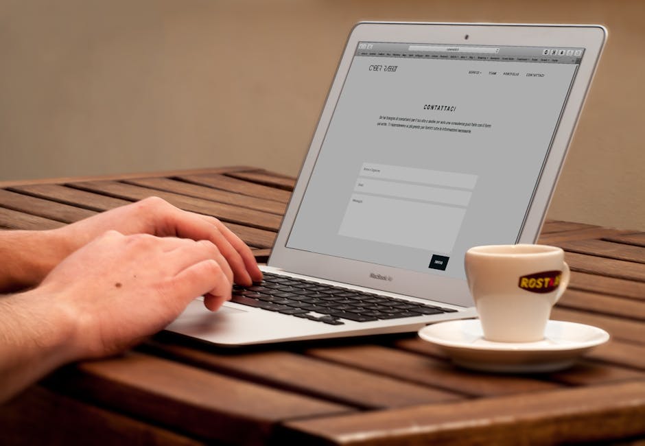
Human Using Laptop Beside Teacup on the Wooden Table

An efficient web form makes it easy for people to practically do everything on a website. Whether you need to sign up, buy a product, subscribe to a blog, leave a product review, web forms are important to complete your action.

Forms typically has five distinct parts:

  1. Input field. This is where users input their information. It can either a text box, a check box, a list of buttons, and so on.
  2. Field label. This label indicates the name of the input fields. So, users will know a name should be entered here and an address should go there.
  3. Form Structure. This refers to the order and the appearance of the fields.
  4. Action button. This performs the action. If a user clicks on buy, he should be able to proceed to the checkout form. If a user clicks on next, he should be able to go to the next page.
  5. Feedback. This verifies the action taken. Once a user finishes his purchase, there should be a message saying thank you along with the details of his order.

In designing a web form, you should first consider the structure.

  • The order of the fields.

    Like in any conversation, you say your name first. Same is true with forms. On sign up, you don’t ask for date of birth first or the location, you obviously ask the name first.

  • Only ask for important details.

    People on the web are in a hurry. They want to buy something, they click and viola! Make sure to ask only what is needed. An extra field of question will increase the chances of abandoning the page. This is very crucial when you are selling online because this affect your conversion rate.

  • Group related fields.

    It’s not only the order that’s important. You should also need to group related questions in a logical manner. Personal details should go first, the shipping address next, the billing address, and the payment method. You don’t ask the birthday on the payment method section. The correlation between fields should make sense.

  • Stick to one column.

    Forms should be one straight line because it’s easier that way. Multiple columns will confuse users and will likely answer them incorrectly. Never design a form with two or more columns.


Whether it’s the field label or the input label, texts should be always be clear.

  • Limit the number.

    Field labels are NOT help labels. It should be direct to the point and limited to one to two words. This makes your form easier to scan for users. For example, when asking for someone’s name, you simply label the field: Name or Full Name. You don’t say: MY NAME IS.

  • No to Upper Case.

    Sentence case offers a better advantage than indicating labels in ALL CAPS. Upper case letters are harder to read. Thus, your users will  experience difficulty in scanning the form.

  • Top alignment.

    Matteo Penzo’s article on labels indicates that web forms are completed quickly if fields labels are on top of the input labels. Users – specifically mobile users – can easily scan and answer the forms. If the top-aligned labels are completed faster, the left-aligned labels are have the slowest completion time.


Since action buttons trigger an action, there should be a clear distinction between different buttons.

  • Primary buttons should have the stronger color.

    The submit button should be clearer than the back button. The submit button is more important than the back button. If the buttons look the same, users can easily click the other button thinking it was submit. To reduce mistakes, you should choose a lighter color for the secondary buttons like BACK, PREVIOUS, CANCEL.

  • Button location is important.

    Multiple forms needs a back or previous button. If the back button is located to the next button, then, most likely users can accidentally click it. Please do not put a secondary button beside an important buttons such as PAY AND SHIP, or PROCEED TO CHECK OUT.


Always design a form from the perspective of the users.  Do not make their shopping experience terrible instead make this process easier. So, in the future, they will choose to transact with you again. These are only minor changes to web forms yet they can greatly contribute to usability. It will definitely help your users without spending so much!

The Don’ts in Creating a Sterling Website

Macbook Pro Beside White Cup And Saucer On Table

When you would let an average person design a website, he would probably think of sales immediately and that adding banners about your latest promos will bring in more customers. A good web designer will tell you about banner blindness and overwhelming your customers with flashing ads will not help. There are website elements you have to take into consideration.

To be able to effectively gain customers, you should not give them a headache.

  • Do NOT make your website visitors wait.

    If your website takes more than 10 seconds to fully load, your website visitors will have second thoughts continuing a transaction. After that, they will group impatient and get frustrated easily. Segregate your website into sections that way customers won’t have to wait.

  • Do NOT place boxes everywhere.

    Imagine a website with a home page that has boxes of images everywhere. It isn’t a pretty view. Your customers won’t know what picture to look at. A disorganized page will surely give its readers a headache. Do not fill your homepage with pictures of all your products. Instead, choose a limited number of products to feature.

  • Do NOT put too many irrelevant ads.

    If your website contains 70% ads and 30% content, you are doing it the wrong way. The main core of a website is CONTENT. Prioritizing ads more than your viewers is an awful choice. Give your website visitors informative content by providing buying guides, life hacks, and video tutorials.

  • Do NOT use 7+ colors.

    When making a website,  it doesn’t have to be the most colorful. You do not have to use all 64 crayons on your website. Website colors should not clash. Instead, they should complement each other. So, the content is easier to scan and read. It is advisable to look for the color palette that fits your brand. Learn about the color wheel or consult a web designer. Your website should use a maximum of 5 colors.

  • Do NOT write blog posts that are 1,000+ words long.

    Let’s face it: no one wants to read a long post with zero pictures on it. People would pass on reading a 1000-word article that contains no formatting. If possible, compose your blog posts with 500 words and it goes beyond, utilize bullets and numbers to make your points obvious. If a topic is long, then, cut it into parts! That would also entice your website visitors to come back for more.

  • Do NOT just post about random things.

    Since we’re on the topic of blogs, each blog post should tell a story. It should NOT be about what you ate, or that you went shopping. If you are going to post emojis and updates, do it on social media instead. If what you have is personal blog, write about your travel abroad, a book you enjoyed, or a movie that made you cry.

  • Do not fill a page with keywords.

    You can’t cheat and fill your post with keywords. Google will know and there will be a penalty for stuffing keywords into one page. Your post should make sense and not some gibberish just to fill space. Only add keywords as you deem fit! Plan your posts ahead of time so you can research enough information about it.

  • Do NOT make your website visitors find something.

    A website should make navigation a priority. It should follow a certain hierarchy and should have helpful tools like a search bar, contact form, and customer service hotlines. You should play a game of hide and seek with your customers. Your website should be friendly to people whether they are tech-savvy or not. Make their experience on your website a pleasant one. Signing up should be easy and shopping should be done with a few clicks only.


Tips & Tricks: The Twitter Edition

advertising, alphabet, business

If your followers are mostly on Facebook and Instagram, you may find these tips helpful. If most of them are active on Twitter, don’t fret. You can use these tips below and learn the ins and outs of Twitter.

  • Use the right #Hashtag.

    Before Facebook used hashtags, it was Twitter who applied the use of hashtags. Today, every social media site followed along! In Twitter, users can easily engage people using a specific hashtag. The top trending hashtags of the time being are displayed on the home screen. The top trends vary depending on location and time. If you want to see what’s up, just click on a particular hashtag and start chatting with people!

  • Keep on Tweetin’.

    One tweet is only visible for an average of 18 minutes long. If your tweet does not get retweeted, try again. Paraphrase each message and tweet again the content again after some time. Create tweets of the same content at least 3 times and schedule them at 3 different times also.

  • Use Twitter’s Advertise feature.

    Like Facebook, Twitter also has a paid feature, and you have an option to promote a hashtag, an account, or a specific tweet. If you are boosting your Twitter account, make sure that the account information is complete and a bio, a website link is all provided!

  • Reach out to Influencers.

    If you mention a popular product, app, person in a blog post, mention them on your tweets once you share it on Twitter. It won’t guarantee a retweet, but imagine if they decide to retweet your post. That will definitely help your content to reach new heights!

  • Use the Right Keywords.

    Twitter is not all about hashtags. You also have to use the appropriate keywords. This particularly important for Twitter ads because they usually target certain keywords on latest tweets or Twitter searches. So, use the relevant keywords that fit your brand and include them in your Twitter bio and pinned tweets.

  • Join Twitter Chats.

    Even if Twitter is a microblogging website, people can still have long chats. How? Twitter chats are usually conducted a Q&A style. These online gatherings use a specific hashtag and Twitter users should use the hashtag during the duration of the chat. Whether you ask or answer, your tweet should include the hashtag. It’s a great way to connect with your Twitter followers or start a discussion among your circle.

  • Tweets Should Be Short and Concise.

    Even if Twitter supports up to 280 characters now, your tweets does not have to be longer than it should be. Tweets with higher click-throughs are those with 120 characters.

  • Mention People.

    Interact with people especially those who reply to your posts. A simply thank you would be appreciated by them. If they ask a question, answer them. It’s a great way to ask/answer without having to compose an email. Most companies provide customer support on Twitter and they are just one tweet away. Users get immediate response about their concerns.

  • Tweet when Your Followers are Online.

    Experiment on when to send out tweets until you find out when your followers are mostly online. Once you figure it out, schedule more tweets at that time.

  • Schedule Your Posts.

    If most of your followers are online during nighttime, no need to lose some sleep over it. With Tweetdeck, you can easily schedule your tweets beforehand. As much as possible, try to tweet the same content 3 times.

  • Add a “Click to Tweet” Button.

    If your website visitors are usually from Twitter, help them to share your blog posts faster by adding a Twitter button. They will just have to click to tweet, and they will be redirected to Twitter to share your latest post.

  • Share Your Reaction.

    Yes, from time to time, you can schedule tweets, but try to squeeze your own personal reaction on certain trending topics. Your followers will appreciate it if you add a personal touch to your tweets. Reply to conversations where you are mentioned.

Tips & Tricks: The Facebook and Instagram Edition

accounting, apps, bookkeeper

Previously, effective marketing strategies were shared in this post. What if you have more followers on Facebook? Here’s a list of strategies applicable on Facebook. Plus, bonus Instagram tips too! Since Facebook and Instagram are siblings now, this list will include tips on spreading your content on both social media apps.

Brighten your Facebook page with these tips:

  • Inspire People.

    Most people are tired of drama. Instead, they want to see something that will lift them up and motivate them to do better. If you are an online bookshop, try including  a famous line from a book along with a link that will redirect them to the product page.

  • Animate posts by using GIFS. 

    Using the right images can increase traffic. Facebook now supports GIF and this will help you animate your promo posts on the said site. Time to ditch stagnant pictures and choose relatable GIFS to gain new followers from the millennial crowd.

  • Post on Facebook Groups.

    You can also share your blog posts on several Facebook groups. There are plenty of groups that are public. You are free to post and promote anything you want. Make sure you included working links on your post.

  • Ask their opinion. 

    With the help of Facebook Business Manager, you make your own poll. Feel free to ask your followers their favorite from all their products, or ask them their most anticipated product. This way you will know what products are popular and should produce more of.

  • Boost your post.

    The moment you posted a new blog entry, spread the word on Facebook. Don’t forget to give it a huge boost! Just so you know, this is a paid service and the fee depends on how long will the extended exposure will be. You are sure that your blog post will show up on your target audiences’ timelines. Since this a paid service, use it wisely and promote big events like Black Friday Sale, or Christmas Sale.

  • Facebook’s Lookalike Audiences.

    This paid service is ideal for humongous businesses. Lookalike Audiences will help you connect with people who might be interest on what you have to offer. Facebook will make profiles of your Lookalike Audience using your existing customers. You just need to select a source and Facebook will find the common qualities of these people. Sources should be at least 100 people from one country, Facebook recommends the selected source should be around 1,000 to 50,000 people.

Add color to your Instagram feed:

  • Show a preview on Instagram Stories.

    These stories are temporary posts and are only viewable for 24 hours. After a day has passed, the story gets deleted and you can add a new Instagram story for the day. When is the best time to use it? Fashion previews, new product teasers, and sale announcements. Tease your followers with the products for the sitewide sale or release a sneak peek for your new collection.

  • Catchy Instagram Bio.

    Instagram is mostly composed of pictures, but that does not mean that texts are not allowed. Typically, people just add emojis, but one way to utilize it well is to add words and links! Inlcude a catchy line and the call to action link to your latest product line.

  • BONUS: Live video.

    Both Instagram and Facebook can interact to their followers through the live feature. You can do Q&A sessions with your followers and this time around they can ask you questions. The live interaction makes it fun, refreshing, and importantly, more personal. Your followers will see the people behind their favorite page. It’s easier for people to identify you and they will feel more secure availing your products and services.

10+ Web Design Terms for Non-Designers

Imac On White Surface Near Apple Keyboard And Magic Mouse

The world of web design is complex. Learning its terms is like learning a new language. You will encounter terms such as CMS, hosting, compressionCSS. For some, it may seem familiar. For other, it can be a bit overwhelming.

There are numerous technical terms in web design and these terms can bewildering for a non-web designer. Before you start on working on your web design projects, brush up on some terms.

This list oft terms may be basic for some, but these are very important terms that you will encounter often:

  • CMS (Content Management System)

  • This refers to the platform that allows web designers to create and modify the content of a website without learning any technical knowledge about computer codes.
  • Domain

  • It is name of the website. Before, domains usually ends with a .com, .net, or .org. Now, domains can end with .ch, .to, .io, and .me.
  • CSS (Cascading Style Sheet)

  • used to illustrate how a website written in HTML or XML will look. CSS characterizes how certain web elements will appear when rendered on screen. Additionally, it allows modification of elements such as size and color of the text, background image, position of the paragraphs, and many more.
  • Compression

  • Files and images used on a website should be able to load fast. Compression is reducing a file into a reasonable size that occupies less space to help a website load faster because a speedy website is what we all aim to have.
  • CTA (Call to Action)

  • The website’s CTA are buttons encouraging you to “Download here”, “Shop Now”. There are a variety of CTA buttons on every website that entices users to take a particular action. These buttons should be large enough for users to see. As much as possible, it should be within reach. Getting that free download shouldn’t take several clicks.
  • Hex Color Code

  • six-digit code that starts with a number sign. Each hex code is unique and has a color assigned to it. Examples: #cbbeb5, #ff0033, and #62a8e1.
  • Typography

  • Is the technique of arranging and using different typefaces. With typography, websites are able to make sure that their texts are legible and readable for their visitors. It involves choosing typefaces, sizes, line spaces, and the likes.
  • Hosting

  • A service enables individuals to allow their website accessible for public use. Once a site is uploaded, people who know the domain name will be granted access. A good hosting service should be a able to guarantee a secure and reliable hosting.
  • SEO (Search Engine Optimization)

  • This helps your website to appear in different search engines results. With the right SEO technique, your website will be one of the top results on websites such as Google, Yahoo!, Ask, and more.
  • Visual Hierarchy

  • Before web designers start the actual designing, they create a visual hierarchy first. They need to establish the important web elements and what needs to be emphasized and focused on. To make sure your message comes across the way you want, establish a visual hierarchy of your website first.

  • Responsive Web Design

  • It is important to have a mobile-friendly website. Responsive web design will render your website to be fit in all screen sizes or different devices. This will allow users an optimal and seamless experience.

These are just some of the web design terms that you will help you understand more about creation and development of a website.

How To Create that Quintessential Portfolio

Girl reading a newspaper

A portfolio is not only limited to actual copies of your work, but it is also another avenue for you to show the world who you are and what your future web design projects are. By creating your own web portfolio, you will also create your own brand as a web designer. You might ask, how do I create that ideal portfolio?

Follow these tips in making a captivating portfolio:

  • Present a TEASER on the homepage.

    As you go along, you will have a number of web design projects. You won’t have all day to present your designs and a website visitor will only have seconds to check your web profile. So, make sure your best works are ready to welcome any potential customers. Create a great first impression by showcasing your personal favorites.

  • Easy Navigation.

    You are a web designer. You should know that no one likes an unorganized websites. So, keep it simple. Your website must be straightforward and the navigation must be consistent throughout the entire website. There should be a dedicated page for all your web design projects. Most importantly, the contact page must be obvious for everyone to see.

  • Your STORY makes you unique.

    There are a lot of web designers who handled numerous projects. So, what makes you different? To offer stand out from the rest, share your own journey. Create your ABOUT page and cite some personal trivia. Narrate your humble beginnings and career milestones.

  • Present your DETAILED work.

    This is the important part of your portfolio. There should be a page for all your work. Ideally, you need to need first provide a preview of around 45 to 75 characters. Once clicked, there should be ample information about it. You should state the purpose of creating each design and why it’s the appropriate choice.

  • Describe your design process.

    You may have similar works with fellow designers, but your design process is different from the others.  Let people understand how you deal with the given problem. Show how and why you chose a particular design. It should address a certain purpose and it should provide benefits to your client.

  • Organize your work.

    To help your clients choose a design they prefer, classify your work. Don’t let them choose a needle from a haystack. Group similar web designs together. Make a list of your personal favorites, most recently completed, minimalistic style, and more.

  • Don’t complicate things.

    Non-disclosure agreement (NDAs) may cause an obstacle to your promising portfolio. What you show through your website must be readily accessible. To prevent problems concerning NDAs, it’s better to remove specific details. Present the designs but remove names that would like to remain private. Censor information in a tactful manner and assign a generic placeholder.

  • Highlight what the customers say.

    An excellent way to gain trust to provide testimonials from your clients. These testimonies will encourage website visitors to inquire about your web design services. What should you include ask in a testimonial?

    • Ask the client what they like best about your work. How the new web design improved their website
    • Let the client talk about what they love about working with you. Do not let them talk about jargon.
  • Contact page must be concise.

    What is a web portfolio without its contact page? Make sure that your contact form is easy to use and short. If there are specific information you need to ask, please be specific about them.

  • Last, but not the least, do NOT lie!

    Do NOT claim a group project as your own. You can put a note that you are the lead designer and then mention your team members.


The Dangers Of Affiliate Marketing

Business Newspaper Page Near Black Click Pen and Coffee

If you plan to add an affiliate program on your website or on your online business, find out first the common problems that can influence program’s profitability and effectiveness. You first need to know certain aspects of the affiliate marketing industry.

Here are the kinds of affiliates you should watch out for:

  • Affiliates who leech from others.

    Your marketing partners include the review sites, video bloggers, organizations, and many more. They could be helpful in promoting a brand’s products and services. Most of the affiliates are respected and bring in sales, but others do not.
    The problem happens when a website presumes that all the affiliates in their program are getting new client when in truth, they are the ones who are truly gaining from the hard work of other channels or affiliates.
    An example would be, some affiliates, known as “last-in-affiliates” design their business models to attempt and get customers who are in the buying process or is in the shopping cart.
    These last-in affiliates frequently gets the credit for transactions they did with just a little or no effort. In the end, companies still pay these affiliates a hefty sum.
    To prevent this, it is vital to find out your affiliates’ tactics and know how that are really promoting your brand.

  • Unprofessional Affiliates.

    Most affiliates are moral partners, there are still those who aren’t. These unethical marketers are not good for business as they do misleading marketing activities just to get their commissions.
    For example, they could use a website’s likeliness to promote and sell products or services without the permission of the rightful owner. It could really put one’s website in jeopardy that the integrity will be at risk. It is important that you do something to let the public know about this.
    To be on the safe side, you need to screen each of your affiliates or partners very carefully, have a clear insight in what and how they are doing to represent and promote your brand.

  • Dissimilar incentives.

    You have no way to do checks and balances; therefore, the incentives will not be aligned. These incentives can lead to fraud, serious issues, cookie stuffing, and trademark bidding.
    Sadly, although the industry has already matured and evolved, some of those misaligned incentives do exist as they are beneficial to many of the players in the value chain. Taking out these behaviors may mean lesser profit.
    Luckily, there are still companies who are discriminating as to who they partner with. They have started rejecting partners who does not represent their brand with great integrity and those who accept bribes. This is such a great attitude that will help the affiliate model reach the level when everyone has a chance to be good and work together productively.

Nuances is prevalent and it happens in every industry.

Some could be danger to one’s brand.  You have to screen incoming and outgoing affiliates and make sure they are transparent on how they promote your website. To be fair to you, they should be able to justify the money they are earning by showing honest results.